Overview
Pip Lancets by Coldbru Digital provide a safer, simpler and painless alternative to traditional finger sticks and lancets for diabetic blood sugar testing. Traditional lancets have needles protruding and can cause fear & anxiety in users. Pip Lancets on the other hand, eliminate those fears because needles are not visible!
Website: piplancets.com
Client: Coldbru Digital
My team: Solo
“Eliminate the frustration, hazards and pain of diabetes finger sticks with Pip Lancets.”
The Problem
Unlike other consumer products, lancets target a specific segment of the market (diabetics). The client, Coldbru Digital, asked me to make a new homepage that will effectively convince users to buy more Pip products and increase website traffic.
My objective was to ensure the Pip website convinces users that pip lancets are a better alternative to traditional lancets.
For my research I conducted 2 interviews and 1 SME (with a senior product designer) to gain insight from users on the design. I also compared Pip with other competitive websites. From this research I:
Gained guidance from a senior designer on argument format
Highlighting the most important product information and getting rid of unnecessary information
Realized that “Let’s get started” on the main button wasn’t explicit enough. Changing it to “Start my Trial” was more clear to the user that by starting a new trial, they get to try the product first.
& My Solution
These important insights helped me learn a lot about the marketing aspect of design and ultimately for this project I:
Redesigned Pip with an aesthetically pleasing design
Ensured the header & sub-header made a strong claim
Convinced the users why Pip is better than a classic lancet by putting the best arguments at the top of the page
Redesigned the reviews section
Bookended the “start a trial” offer and concluding with a final convincing marketing argument
But also!
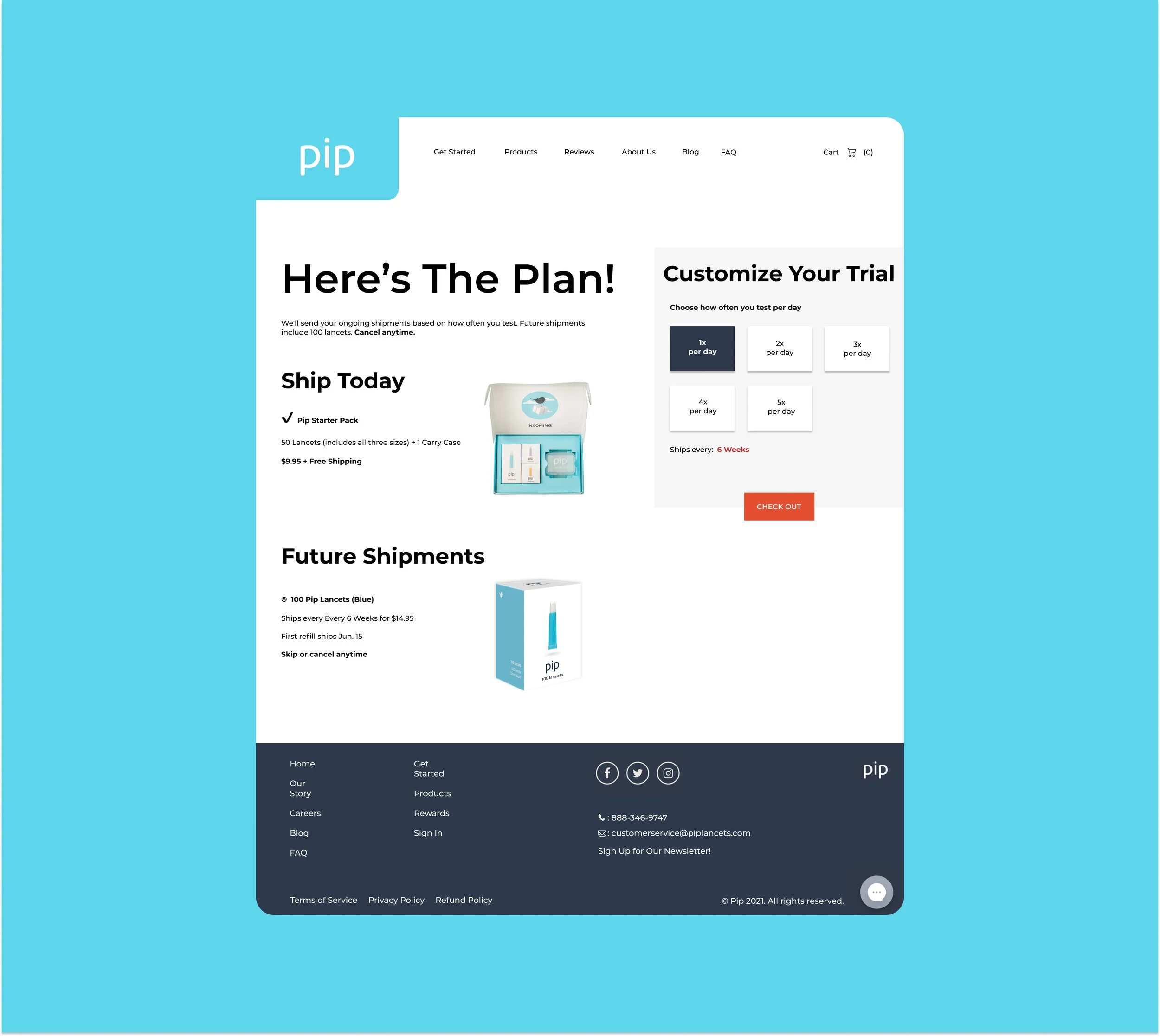
I also redesigned the “Let’s get started” page. I decided to combine the “hear the plan” and “customize your trial” sections into one unique experience on one page, rather than separate pages. I received positive feedback on this change when I conducted my interviews.
In Conclusion
This freelance project was incredibly valuable for me as a designer because it gave me great insight and training into the marketing side of UX/UI Design. The challenge was not to just to redesign the webpage but also to create more value for the product through design decisions. This project expanded my experience in product, design, and product marketing. It was so much fun!


